Lark
Brand Identity and Campaign Direction
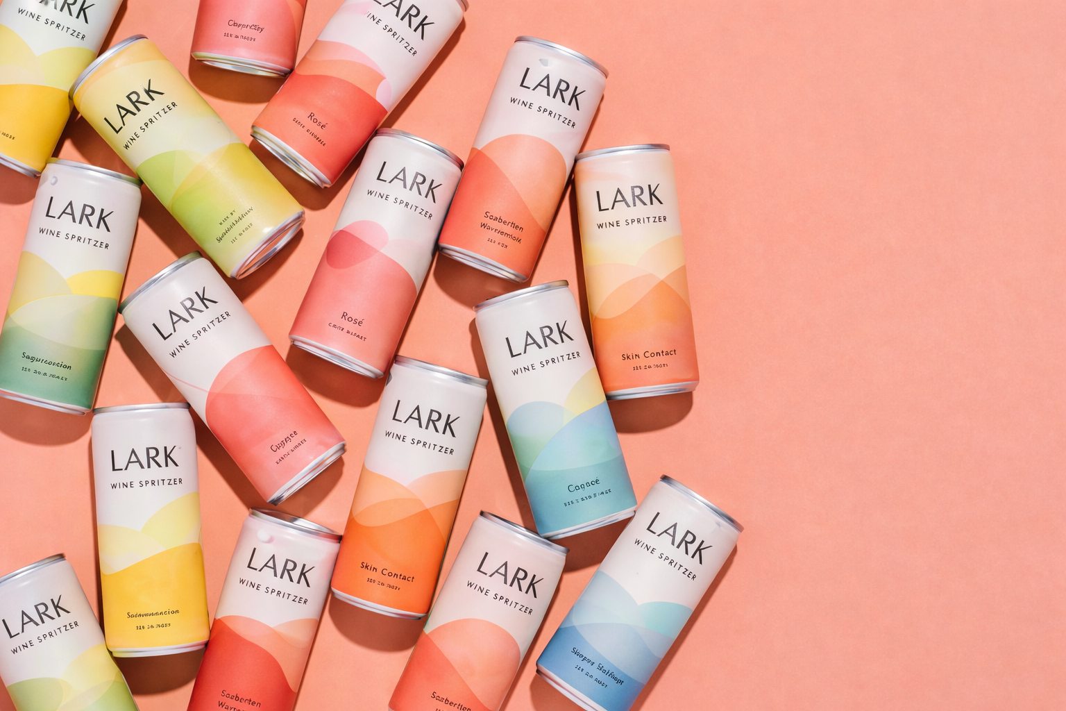
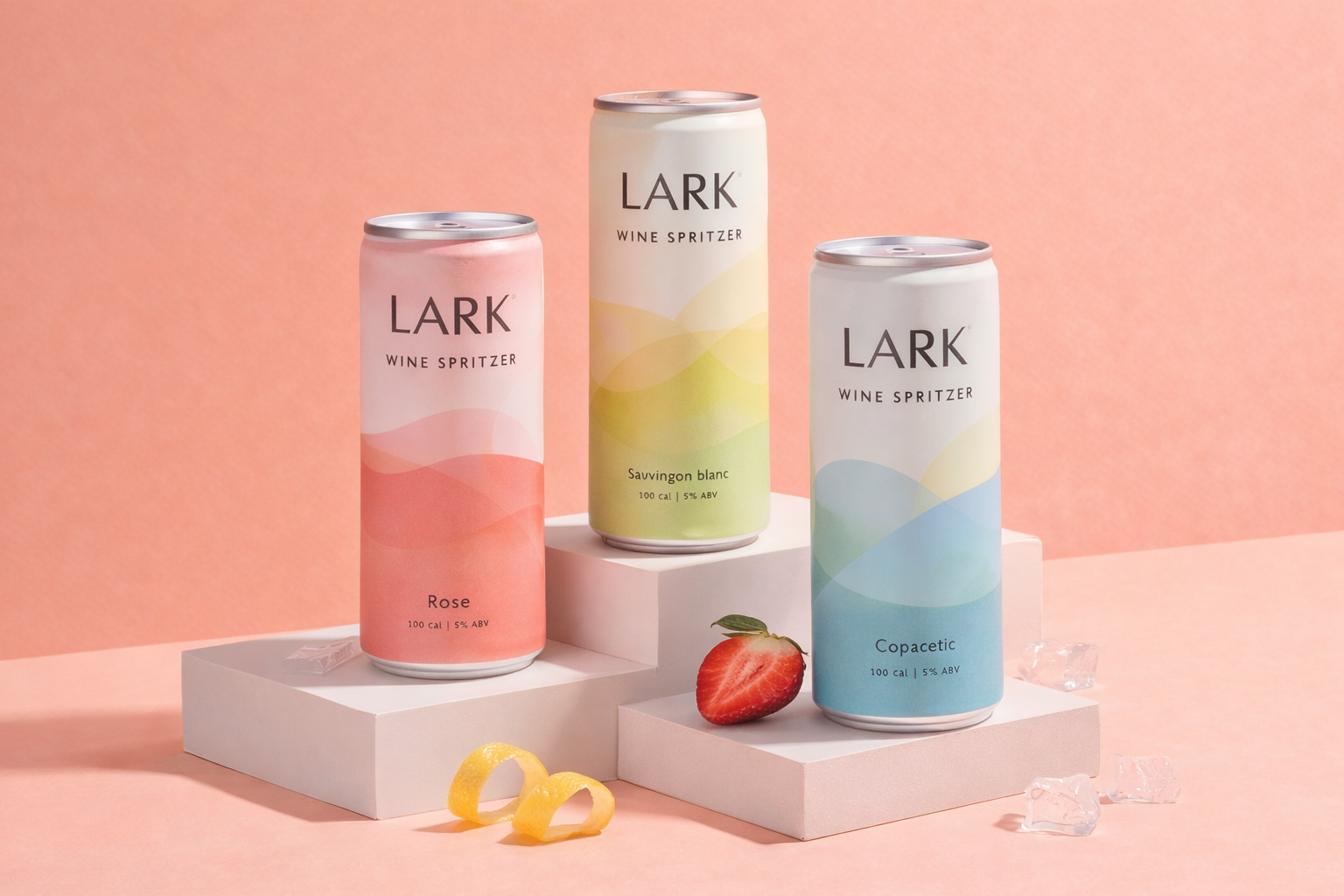
LARK is a contemporary canned beverage brand concept designed for a new generation of consumers seeking simplicity and refined aesthetics.
The objective was to create a minimal yet expressive identity that could translate seamlessly across product, social and retail environments.
My Role
I created the brand direction and packaging system, focusing on:
Strong color blocking
Editorial typography
Clean, structured layouts
The brand needed to feel modern and premium without losing approachability.
Scope of Work
Brand identity
Packaging design
Flavor differentiation system
Campaign art direction
Social media assets
Product launch visuals
Design Direction
The visual system is built around:
Bold color gradients
Clear typographic hierarchy
Minimal composition
Modular design components
Each flavor is differentiated through color while maintaining a consistent structural layout.
Outcome
Cohesive product line with strong visual recognition
Scalable system for future releases
High-impact visuals for digital campaigns
Balanced minimalism with personality