Cold Field Naturals
Brand Identity & Campaign Direction
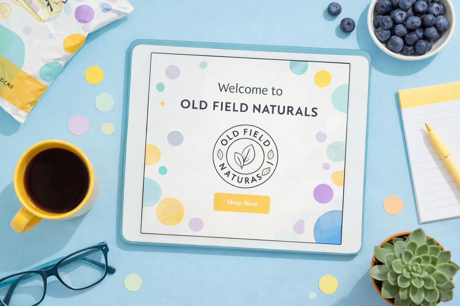
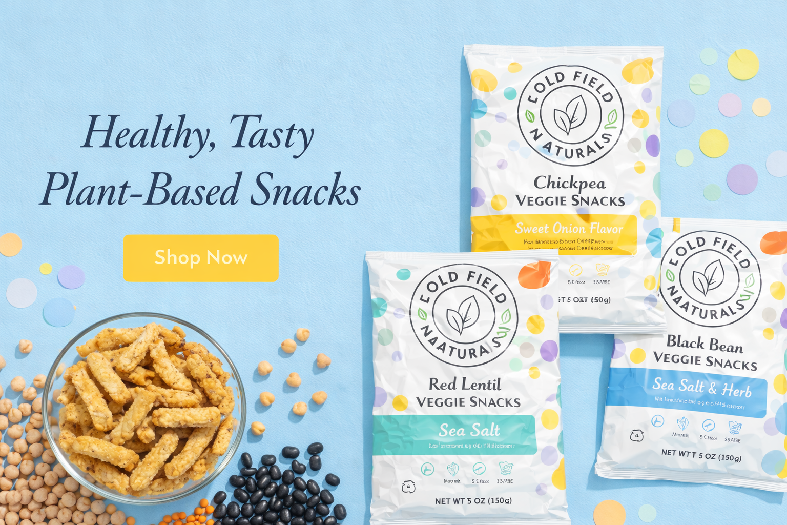
Cold Field Naturals is a plant-based snack concept brand focused on clean ingredients and everyday simplicity.
The goal was to create a packaging system that feels fresh, approachable and contemporary — while standing out clearly on shelf.
My Role
I developed the brand identity and packaging direction, creating a cohesive system that could scale across multiple flavors without losing recognizability.
The project focused on balancing clarity, warmth and visual differentiation.
Scope of Work
Brand identity
Logo refinement
Packaging and graphic system
Flavor color coding strategy
Social-ready product visuals
Design Direction
The visual language combines:
A clean circular brand mark
Soft organic shapes and playful color accents
A structured hierarchy for flavor differentiation
High-contrast product naming for shelf clarity
Instead of overwhelming the consumer with visual noise, the system relies on clarity and repetition to build recognition.
Outcome
A scalable packaging system adaptable to new flavors
Strong shelf presence through color differentiation
A flexible visual identity for future extensions
Cohesive brand expression across digital and print